Sherwin-Williams 2025 Color Capsule of the Year
31st December, 2025
Choosing paint colors is easy—until you want them to look right together. That’s exactly why Sherwin-Williams created the 2025 Color Capsule of the Year: a curated set of shades that feel modern, fresh, and balanced, designed to work across different styles.
Instead of chasing one “perfect” color, this capsule gives you a ready-made palette you can mix and match with confidence.
What’s in the 2025 Color Capsule?
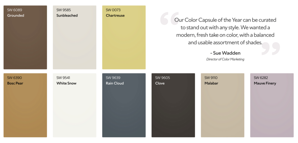
Sherwin-Williams’ 2025 capsule highlights these shades: Grounded (SW 6089), Sunbleached (SW 9585), Chartreuse (SW 0073), Rain Cloud (SW 9639), Clove (SW 9605), Malabar (SW 9110), Bosc Pear (SW 6390), White Snow (SW 9541), Mauve Finery (SW 6282).
– Sunbleached: a light neutral that sits between warm/cool—deeper than white and not quite gray.
– Malabar: a sandy beige that reads soft and inviting.
– Grounded: a rich, earthen brown that adds warmth and stability.
The crisp foundation for trim and ceilings
– White Snow: a bright, clean white (high light reflectance) that’s popular for an airy, spacious look.
The “accent wall / personality” colors
– Rain Cloud: a stormy gray-blue that bridges classic and modern.
– Clove: a near-black deep brown—bold, moody, and high-end when used strategically.
– Mauve Finery: a soft, sophisticated mauve that works as a wall color or accent.
– Chartreuse: a vibrant yellow-green that brings energy (best as an accent, not usually a full-home color).
– Bosc Pear: a golden hue that adds warmth and a luxe, organic feel.
3 Simple Ways to Use the Capsule (No Overthinking)
Clean & Calm (the “modern, lived-in” look)
– Walls: Sunbleached or Malabar
– Trim/Baseboards: White Snow
– Accent: Rain Cloud (office, bedroom feature wall, or built-ins)
Warm & Cozy (inviting without feeling dated)
– Walls: Malabar or Grounded
– Trim/Baseboards: White Snow
– Accent: Bosc Pear (front door, powder bath, nook) or Mauve Finery (bedroom)
Bold & Designer (high contrast, statement finishes)
– Walls: Sunbleached
– Trim/Baseboards: White Snow
– Accent: Clove (island, vanity, interior doors, or one dramatic wall)
Pro Tips to Make These Colors Look “Professional”
– Test in your lighting. A color can shift morning vs. evening—especially neutrals and blues.
– Use the right sheen. Most walls look best in eggshell; trim/baseboards typically in semi-gloss for a crisp, clean line.
– Prep is everything. These refined colors look best on smooth walls and sharp cut-ins—patch, sand, caulk, prime where needed.
At World Class Painting, this is where we shine: clean protection, proper prep, smooth finishes, and crisp lines so the palette looks as good on your walls as it does in the inspiration photos.